Flo
Unlocking investment banking
intelligence.
Product Design
Desktop
Design Leadership
Context
📋 Overview
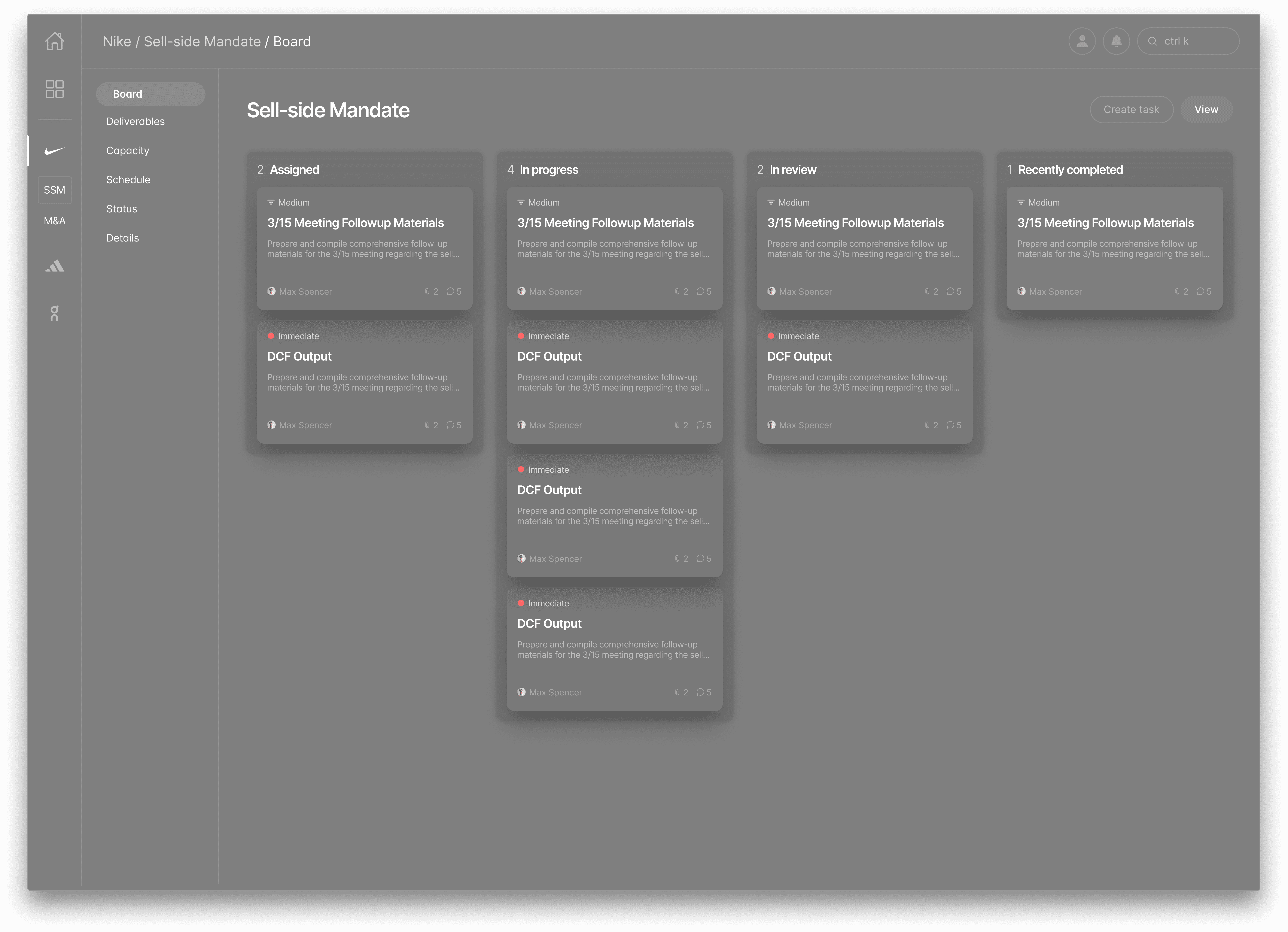
Flo is a piece of b2b software aimed at investment banks with the goal of creating a frictionless and efficient workstream. Using Flo, you can assign, review and complete tasks on documents like slide decks and excel spreadsheets.
It's like Jira meets Github for investment banking.
In this case study, I will focus on the core task completion flow, which analysts would complete as their regular workflow.
At Flo, I was responsible for UX, UI and visual design elements, with a heavy focus on UX.
🛠️ Conceptual Challenges
Version control is a complex concept that investment bankers don't have time to invest in understanding. Abstracting away the logic under the hood was key in decreasing friction within the workflow, not adding it.
Problem
⚡️ The Challenge
How can we help minimize the friction in analyst workflows?
Investment banking analysts current work cycle consists of:
-> Being assigned changes to a document
-> Completing those changes locally
-> Emailing the changes to a reviewing (v1)
-> Download new version from reviewer with suggestions (v2)
-> Make changes (v3)
-> Repeat
Sometimes this feedback is via email, sometimes via teams, and sometimes even in-person reviews. This, in combination with high friction in the workflow, was the key painpoint.


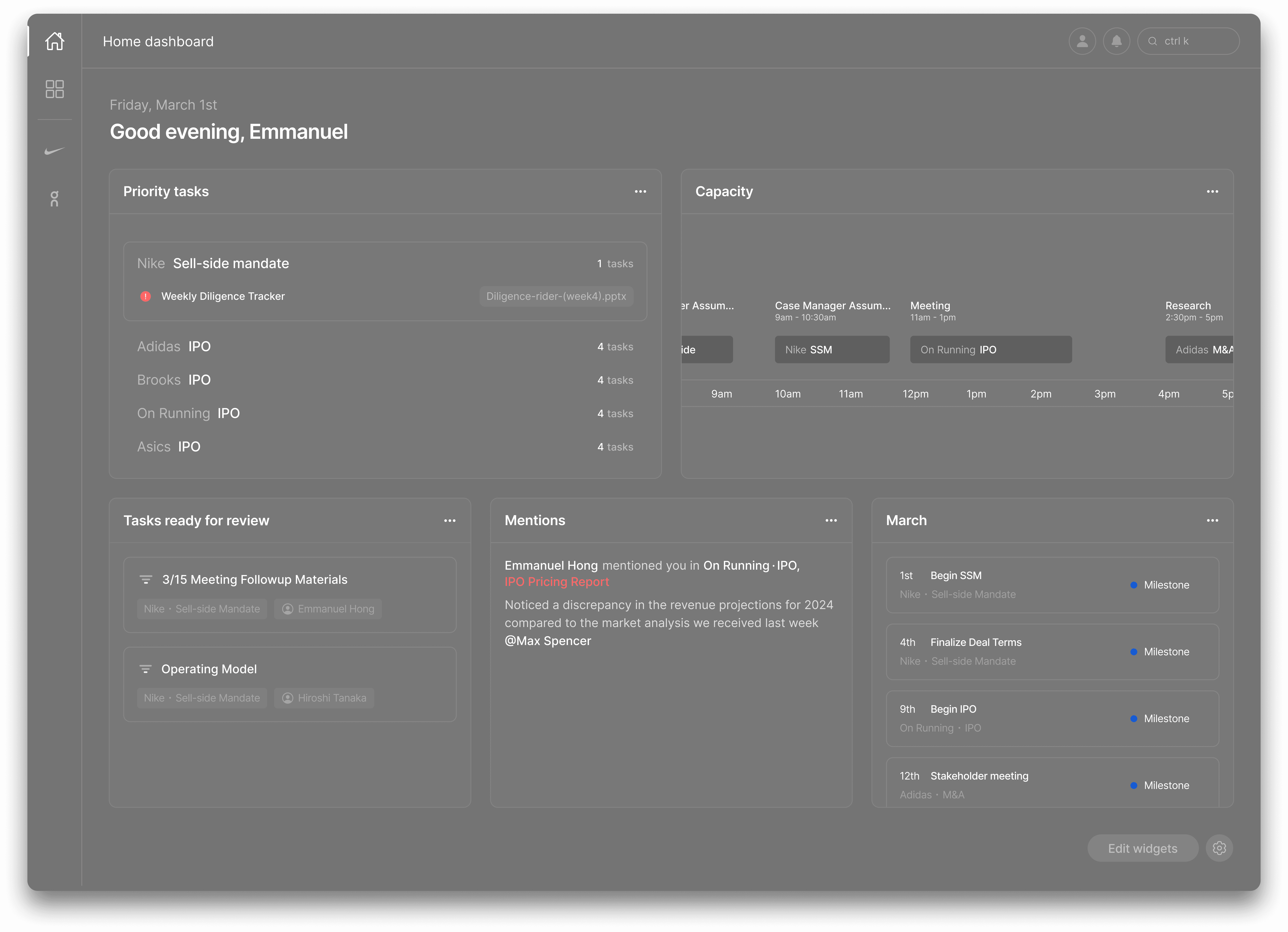
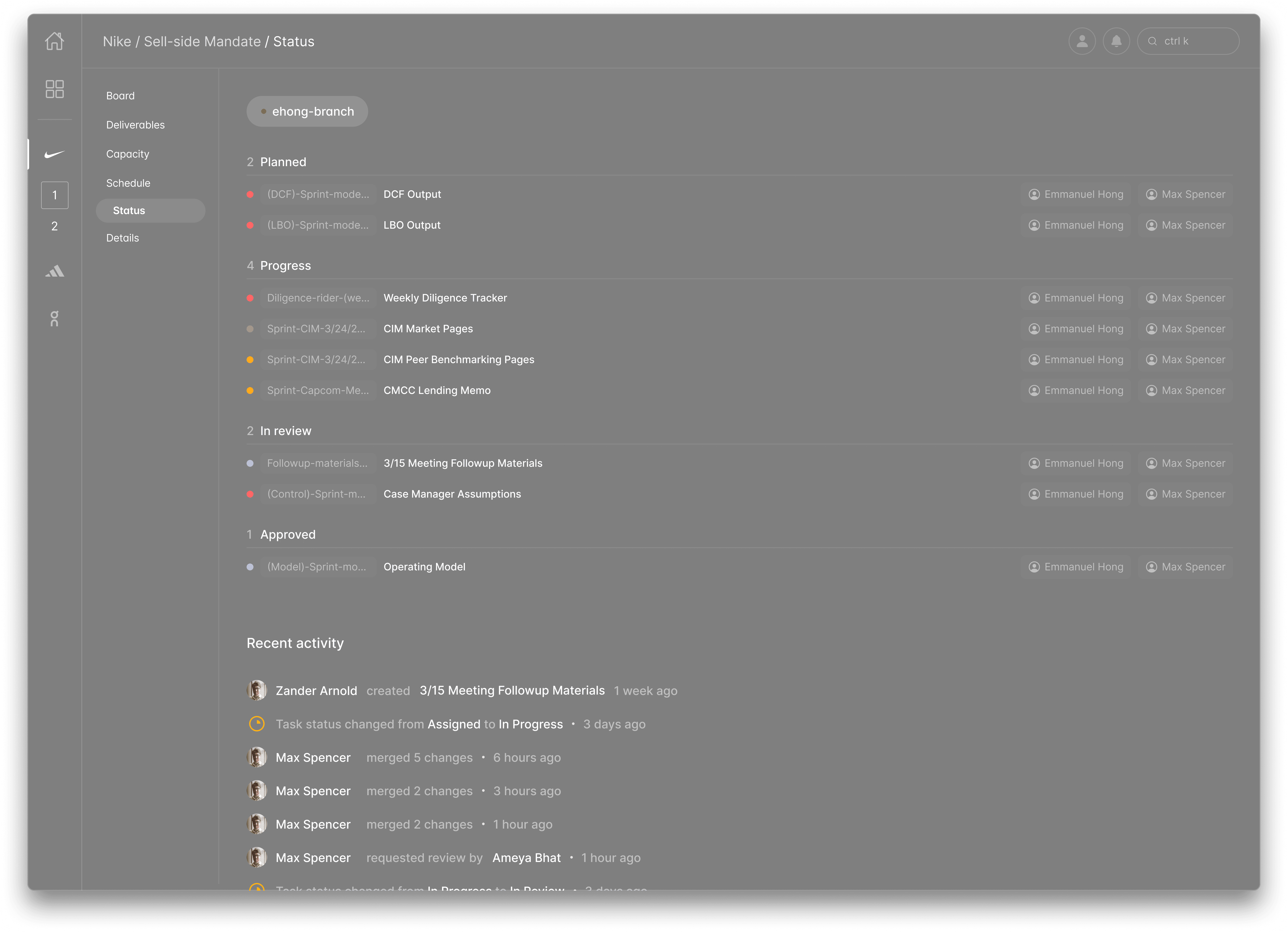
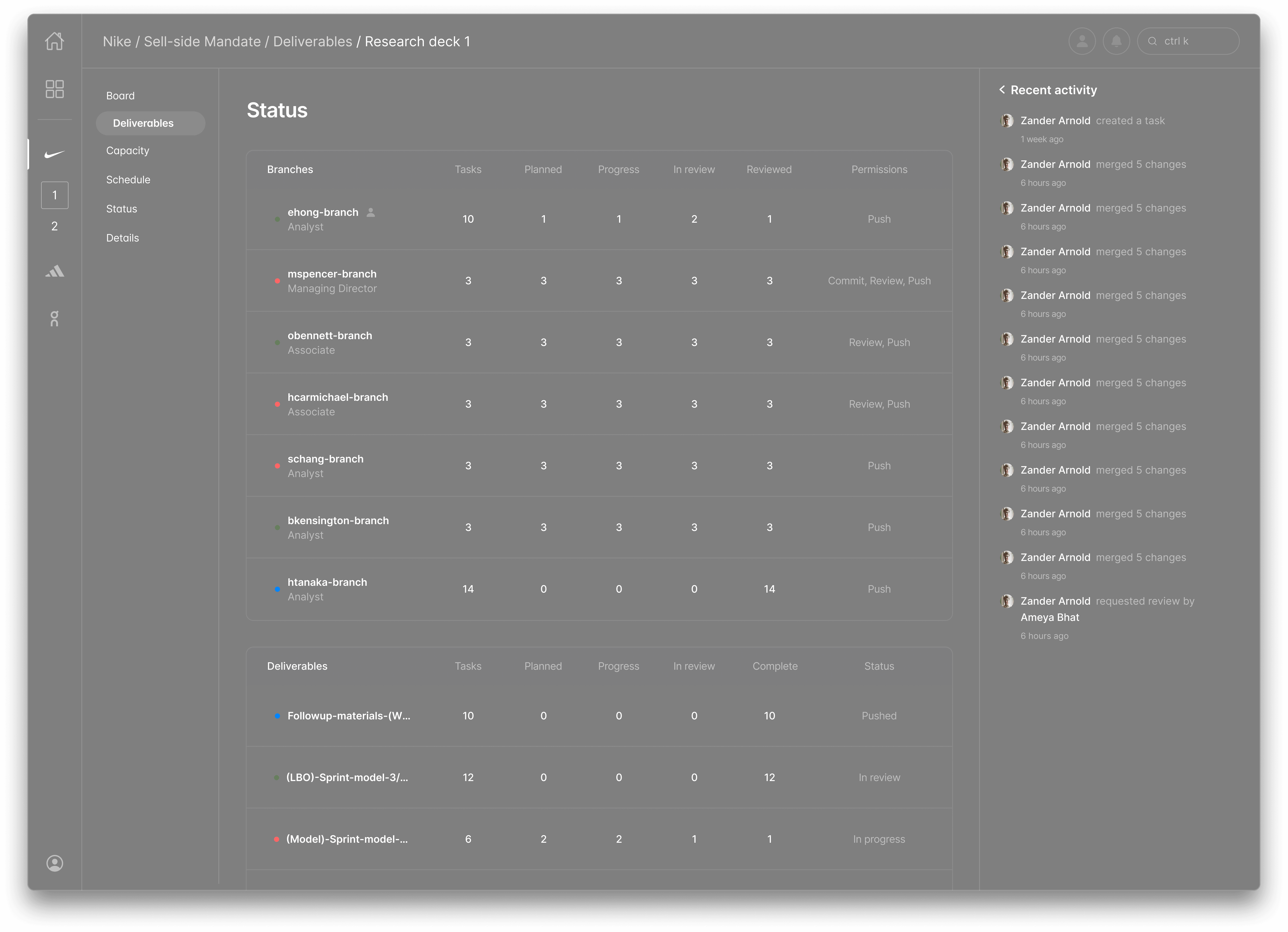
Finished FLO SCREENS
Design Process
👥 Research & User Interviews
To discover the user flow above, we researched and interviewed analysts from companies like Goldman Sachs and Bank of America.
"The process of iteration is cumbersome and full of sifting through and sending emails, downloading files, and disjointed feedback"
-> Investment Banking Analyst

Design process
User flow
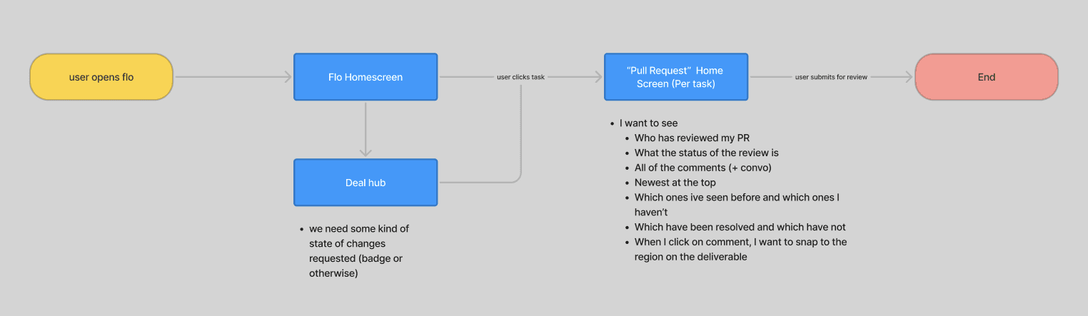
In alignment with the research, we established the user flow.
Investment bankers have limited time as is, so it needed to be simple, and minimize the number of clicks to task completion, while still being more informed than the current workflow
We came up with the below user flow, where:
-> A user clicks on a task
-> Makes changes to a document in flo according to specific comments
-> Submits for review
Design
First Iteration
My fellow designer and I laid out the screens we were going to need to develop in order for an analyst to execute a task. We benchmarked 3 key products (Jira, Github and Figma's "diff view") in order to stitch together a quick MVP.
Design
User testing
Once complete, we user tested the initial iteration with the same investment banking analysts.
Analysts revealed that while we had successfully decreased the friction between internal systems like having to toggle between email, the document, and any additional requirements, it was still too many clicks to submit a task for review. They also revealed that they want to be able to submit a "sub-task" exclusive of the task at large.
Design
Final Iteration
In the final design, we identified some key areas where we could decrease time taken to complete a task, including the final diff view at the end.
We moved this diff view into the main task completion screen so that analysts could review changes as they were making them.
Takeaways
✅ Validate
Validating our user flows and testing them against the method we were trying to improve was paramount to success. Without user testing, we never would've discovered the painpoints in our first iteration. Keeping the user close throughout the process was the only way we were going to succeed in an industry we were completely unfamiliar with
📡 Effective stakeholder communication
Communicating with stakeholders in different industries can be tough at times, but it is important to inform and explain why certain UX decisions were made and how they impact the wider product. As product designers, we must consider the whole product including the business impact and strategy, and this often means breaking down design terms into most digestible language.
Additionally, a massive shoutout to my fellow designer Manny, for diving into what was a complete unknown for the both of us, and for being so supportive along the way.
Credits
Skills
UX Design
UI Design
Prototyping
Digital Design
Tools
Figma
FigJam
Framer
Illustrator
team
Leadership
Zander Arnold
Ameya Bhat
Design
Max Spencer
Manny Hong
Development
Caroline Hughes
Carlo D'Ugo

